A book of reasons
A proposal for an identity.
November 2026
Who Caseproof is
A logo takes its meaning from the thing it stands for, not the other way around. So first, what Caseproof is.
The name
Caseproof began in 2004 as a file-system service for lawyers. “Case was initially going to be a service for lawyers, hence the name,” Blair says. The product never shipped and he never worked in that industry. The padlock in the old logo is all that is left of it. A fossil, drawn on a company that became something else.
The employer
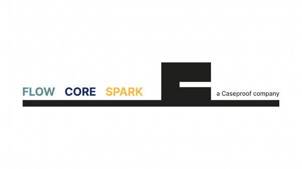
The people work for Caseproof. The products are owned by their own companies: MemberPress, Pretty Links, Easy Affiliate, and the rest. Brands get bought, renamed, spun out. The name on the paycheck has not changed since 2004. One constant, many variables.
The people
The first hire found the company: a man answering strangers’ questions on a demo site in 2009, who lived an hour away. He is still here. To a team that joined by acquisition: “There IS NO CHOPPING BLOCK.” Caseproof buys products partly to get their founders, then makes them leaders.
The owner
That was the whole reason, and it became a belief. “Be an Owner, not necessarily a Boss.” Customers are creators running memberships on sites they own, and they have earned more than three billion dollars through MemberPress. The company’s output is independence.
The values
The 2026 operating line: “People First in values, AI-First in operations.”
The essence
Caseproof is the constant: the company of people behind the brands, the one thing that stays while the products change.
The brief
Five proposals
Each begins with something true about Caseproof and lets the form follow. Each is argued first, then shown.
Proposal One
The brands change; the employer does not. Same name, same owner, same job since 2004 while products were born, bought, renamed, and retired around it. The mark should be a ground, not a figure: the floor the brands stand on.

The argument
The problem. Caseproof needed a mark that says the one thing about the company that is settled. Its products are born, bought, renamed, and spun into their own LLCs; the company behind them has had the same name, owner, and job since 2004. The mark has to sit under nine colored brands and look like it was there first.
The insight. Caseproof is the constant. Blair calls it "largely an employment company," and the legal record agrees: the products sit in Juniper Labs, the people in Caseproof. His rule is "stay the course"; the fifth value is "we lift where we stand." So the mark should be a ground, a thing other things stand on, and look twenty years old already.
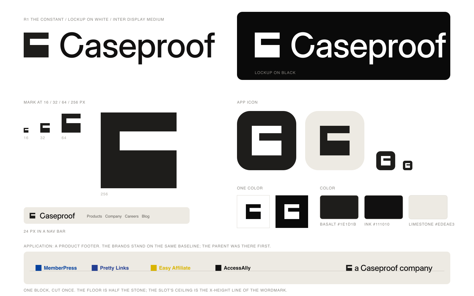
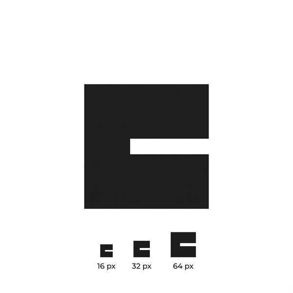
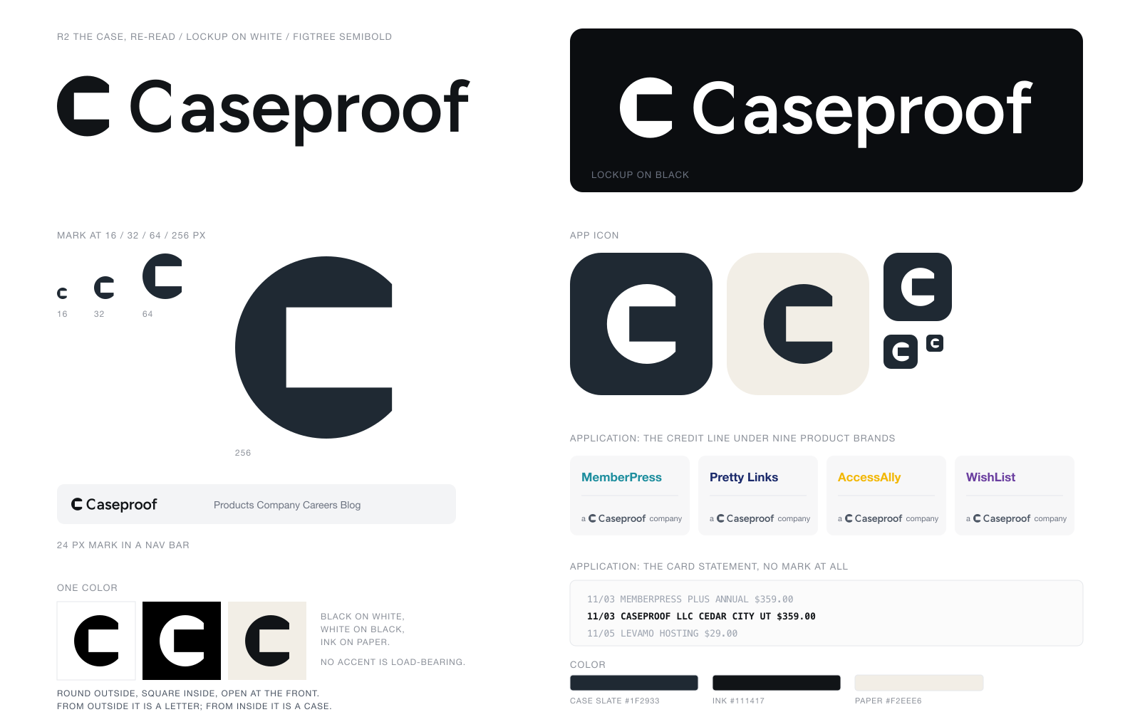
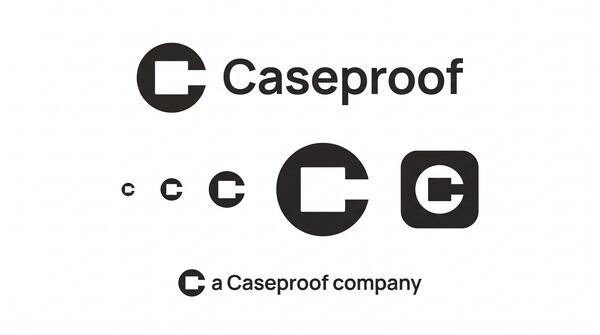
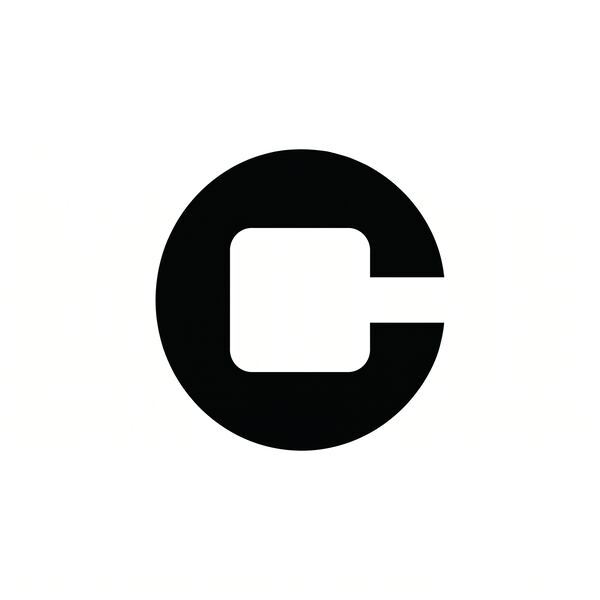
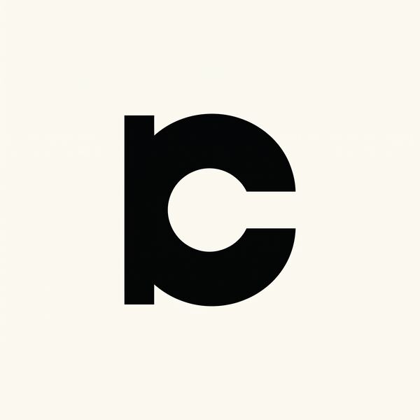
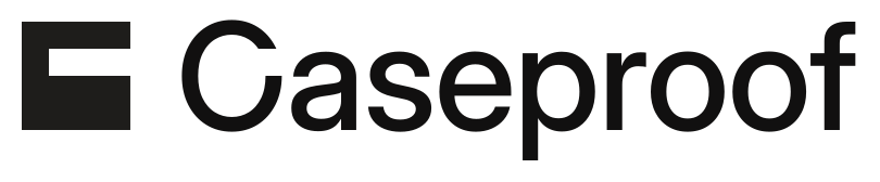
The form. One block, cut once. A solid square with a single horizontal slot cut in from the right, three quarters deep. The slot sits above the middle: the lid is a quarter of the height, the slot a quarter, the floor a full half. The spine is a quarter wide, equal to the lid, so the only heavy member is the floor: what carries the weight is the base. The silhouette is a blunt, level capital C, open toward the name. Nothing is rounded, because a stone is cut.
Why it lasts. At 16 pixels the slot is four pixels and the floor eight, so the favicon is still the mark. At banner size it is a monolith with one precise event in it, and the quarter and half proportions keep it taut. It is the same shape in one color on white or black. An employee draws it in three strokes: a square, a slot, a bit high. It animates with a single move, the cut, because the block never enters or leaves. Beside MemberPress teal or AccessAlly yellow it has no hue to argue with; it is the floor they stand on.
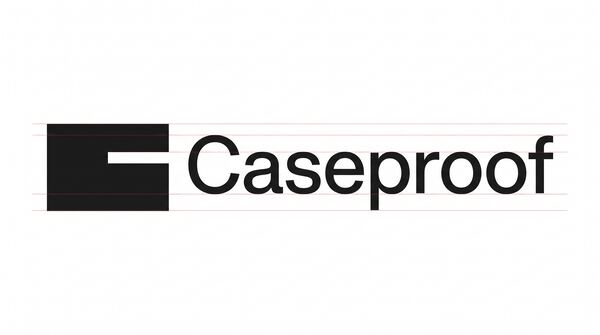
The wordmark. Inter Display at Medium, one weight, tracked at minus 12 thousandths of an em, outlined to paths. It is the least mannered grotesk there is, so it sits beside nine product faces without a quarrel, and its x-height is exactly three quarters of its cap, the mark's own ratio. In the lockup the block runs from baseline to cap line and the slot's ceiling lands on the x-height, so the lowercase letters run straight into the cut. The capital C is Inter's O with the mark's slot cut from it on the same two lines, so the first letter and the mark are one gesture. One word, one weight: "Case Proof" is settled for good.
The lockup
At true size
The app icon

In motion
Proposal Two
The name itself. “Case” began as the legal case and “proof” as secure, which gave a lawyers’ product its lock. Read today, a case is a container that holds things safely and has an opening, and -proof means it holds up. The proven case that holds.
The argument
Caseproof needed a mark that says the one thing in its picture that does not change. It is the employer behind nine product brands that come and go; it has had the same name and owner since 2004. The old logo carried a padlock from a lawyers' product that never shipped. The new mark had to drop the lock, keep the name, and sit quietly under the product colors.
The name already says it. Blair chose "case" for a legal filing system and "proof" for "secure." Read today, a case is a container: it holds things that belong together, keeps them safe, and has an opening. And "-proof" means tested, holding up. Caseproof is the proven case that holds. The company behaves that way: acquired teams keep their names, and its customers own their sites and have earned more than $3 billion through MemberPress. Nothing Caseproof holds is held shut.
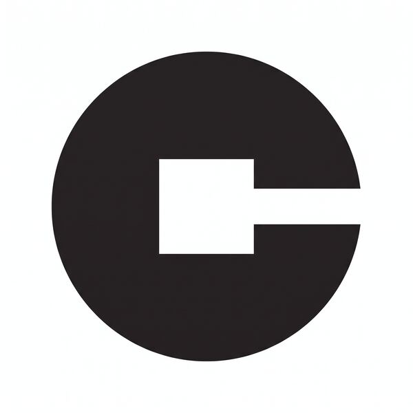
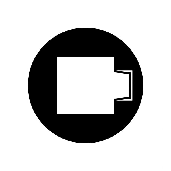
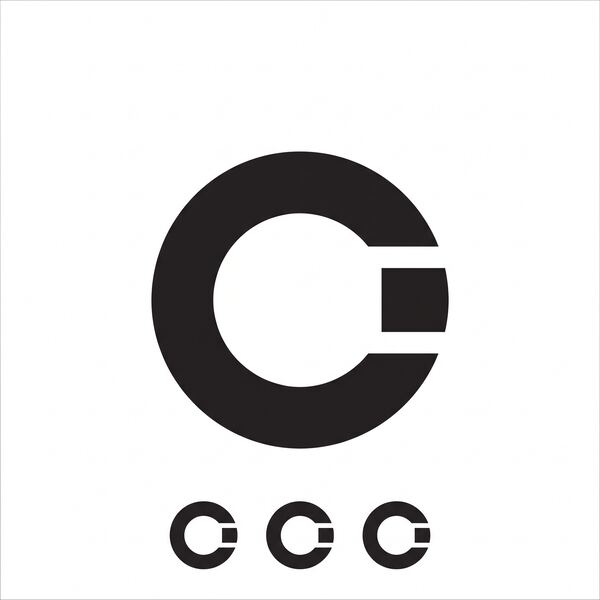
A circle, a square, and one cut. The outside is a disc, which is the letter C. The inside is a square room, centered, 44 units on 100, which is the case. The room runs straight out through the front, so the opening is as tall as the room: whatever is inside can leave. The front is cut flat on a vertical line at 86, which turns the terminals into the jambs of a doorway and leaves the back wall at 28, twice the depth of the jambs. From outside it is a letter. From inside it is a case.
At 16 pixels nothing is thinner than four pixels and the silhouette is a bold C. At 256 the room becomes the subject; at banner size the cuts stay taut because each was placed by a rule. It works in one color, and the slate is near-neutral so the product colors carry the page. Anyone can draw it in five seconds: a black circle, a square hole, open at the front. In motion the disc arrives, the room is punched, the front opens, and the name slides out of the mouth. Under the product brands it is a maker's mark.
Figtree SemiBold, a humanist sans with open apertures, so the c, e, and a carry the mark's open mouth. One word, one weight, which settles the old "Case Proof" split, at minus 0.008 em tracking. The capital C's terminals are cut on one vertical line at 84 percent of the letter's width, the mark's flat front, so the first letter and the symbol are one gesture. The rest of Figtree is left alone; a wordmark that does not perform is the point.
The lockup
At true size
The app icon
In motion
Proposal Three
Caseproof’s claim is not a promise but a record: $3 billion earned by creators, a product still sold seventeen years after its first day. The typographic language of a proof that is finished.
The argument
The problem. Caseproof needed a mark for the one thing in the company that does not change. The products carry their own names and colors. The lock in the old logo belonged to a lawyers' product that never shipped. The mark had to say the part that is settled, in a form plain enough to sit in nine footers, on a paycheck, and on a card statement without apology.
The insight. Caseproof's claim is a record. Creators have earned more than $3 billion through MemberPress. Pretty Links had 184 downloads on its first day in 2009 and is still sold. The guarantee is stated in hours and months. Blair's test for truth is "anything that can't be summarized isn't true," and the values include "we pursue excellence" and "we always strive to do the right thing." The company shows its work instead of promising. The second half of the name says the same thing: proof.
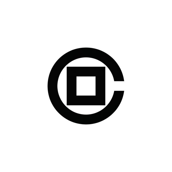
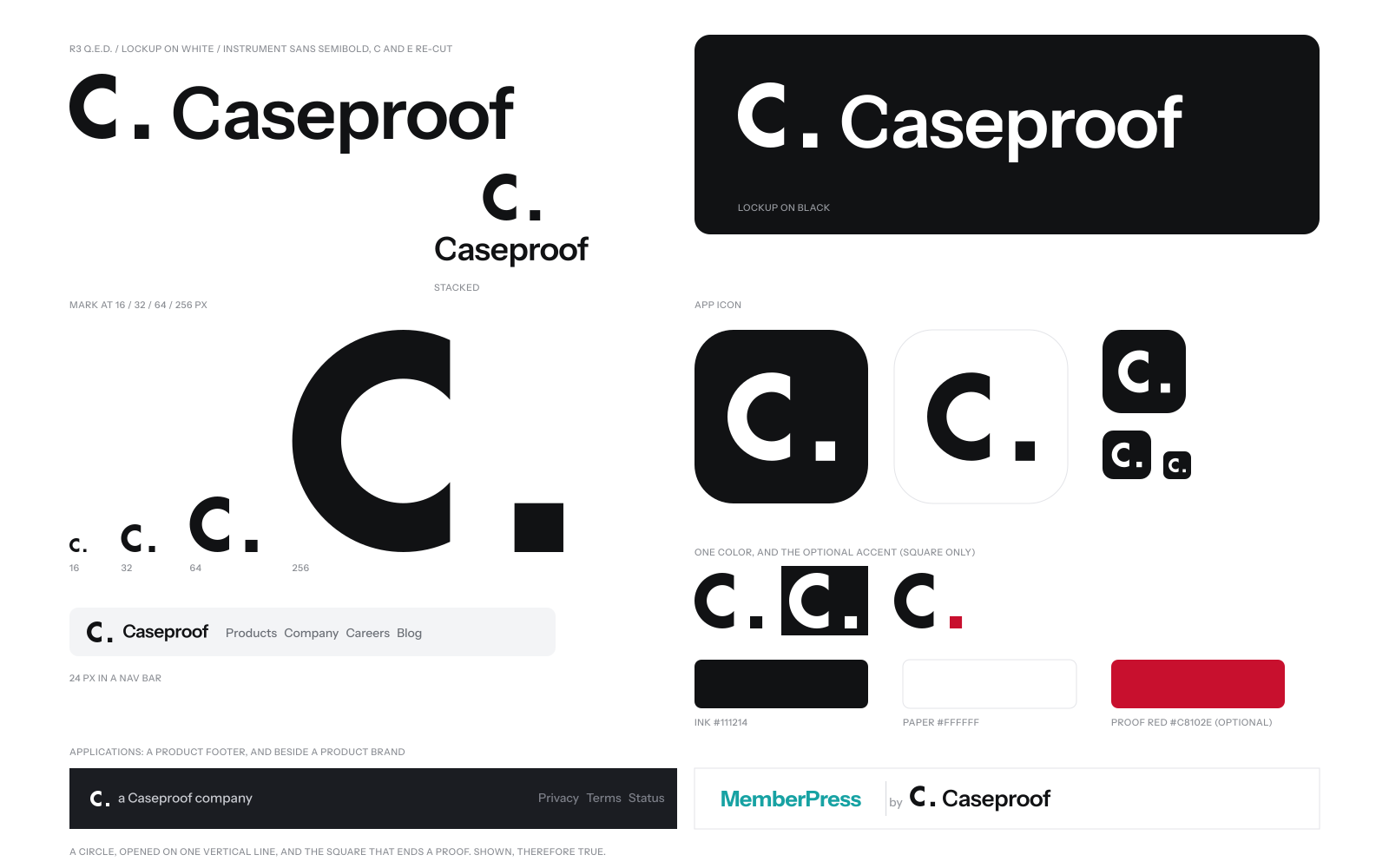
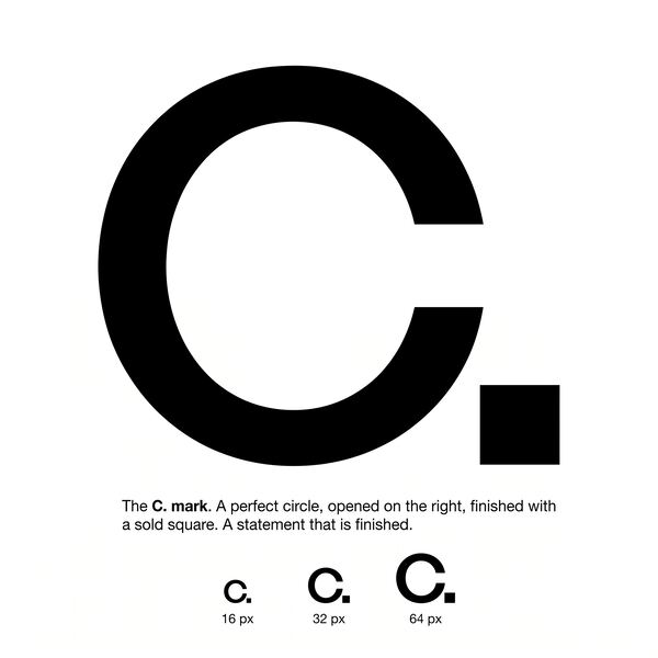
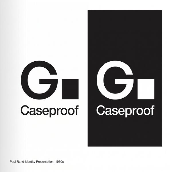
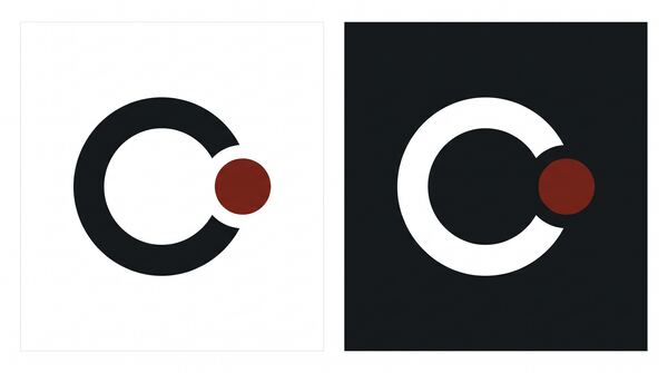
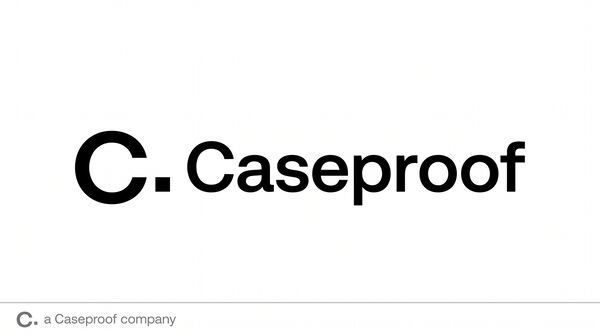
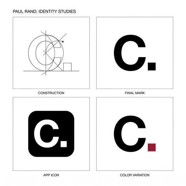
The form. Mathematics ends a proof with a small filled square. Prose ends a statement with a period. The mark is a capital C followed by that square. The C is a perfect circle, 100 units across, one stroke of 22, opened on one vertical line at 71, so both terminals are dead flat and stand on the same edge, like the right margin of a page. The square is 22 as well, one module, and it begins exactly where the circle's bounding box ends, resting on the baseline. Everything is round except one right angle, and the right angle is where the proof ends. Read quickly it says "C, period." Read slowly it says shown, therefore true.
Why it lasts. At 16 pixels the circle is 13 pixels and the square is 3; both survive because nothing is thinner than the stroke. At banner size the cut, the module, and the shared edge hold because they were set as ratios of the circle. It is one color by nature, ink on paper or paper on ink, with an optional red for the square. Anyone can draw it on a whiteboard (a fat C and a square dot) and describe it on the phone. It animates as one stroke drawing on and one square landing. Beside MemberPress teal or AccessAlly yellow it stays black and quiet, the credit line under the work.
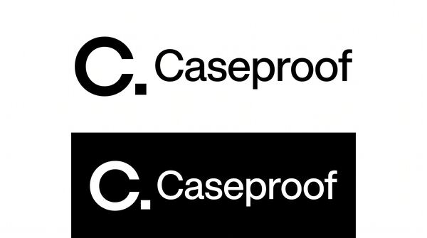
The wordmark. Instrument Sans SemiBold, a grotesk with slightly narrow proportions and flat terminals, the precision of typesetting. Set at -0.02 em so the name reads as one word and settles the old "Case Proof" split. Two letters are re-cut: the capital C's terminals on one vertical line, the mark's own rule, and the e's terminal the same way, so the two open letters in the name end the way the mark ends. Nothing else is touched. The square stays the only right angle in the identity.
The lockup
At true size
The app icon
In motion
Proposal Four
“Be an Owner, not necessarily a Boss.” Caseproof makes owners: of brands, of careers, of businesses. Independence is the product, and independence is visible only as separation with kinship.
The argument
The problem. Caseproof needed a signature that says what the company is. The products change names and owners; the employer has been the same since 2004. The old logo carried a padlock from a lawyers' product that never shipped. The new mark had to drop the lock without drawing the org chart, and stay plain enough to sit under nine louder product brands.
The insight. Caseproof makes owners. Blair started it because he "didn't want to work for someone else." His first law of wealth is "Be an Owner, not necessarily a Boss." Every product gets its own LLC. Acquired founders become product leaders. Customers choose WordPress "for control, data ownership, and pricing flexibility," and have earned more than $3 billion on it. The company's output is independence, and independence is visible only as separation.
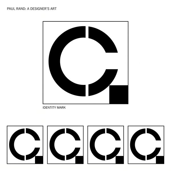
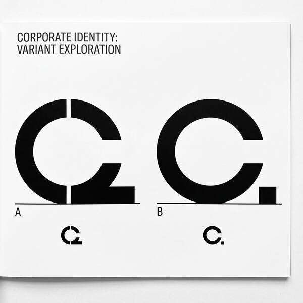
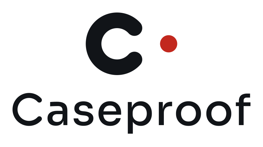
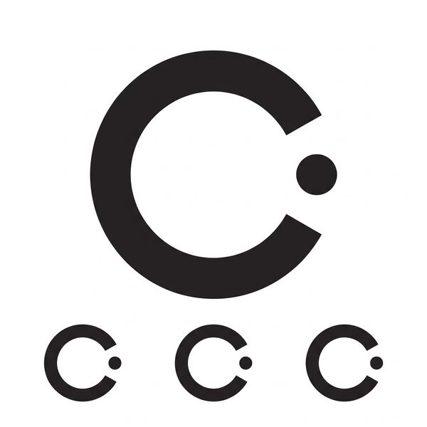
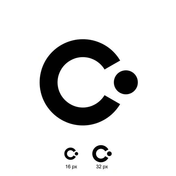
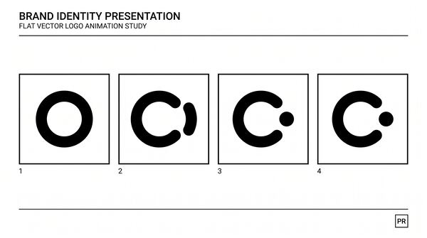
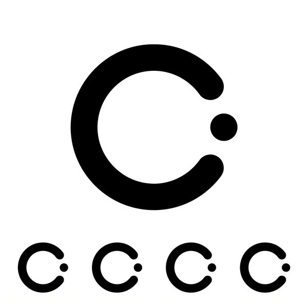
The form. A capital C and one disc. The C is a thick ring, one quarter of its diameter in stroke, with an 84 degree mouth and round terminals. The disc is the stroke's own thickness, set on the centerline just beyond the opening, three quarters of a stroke clear of the ring. The argument is in the ends: the C's terminals are half circles; the disc is a whole one. What left the C is complete, and it is made of the same material. It stands outside, so nothing is held; nothing is cut, so nothing is broken. Two elements, no third.
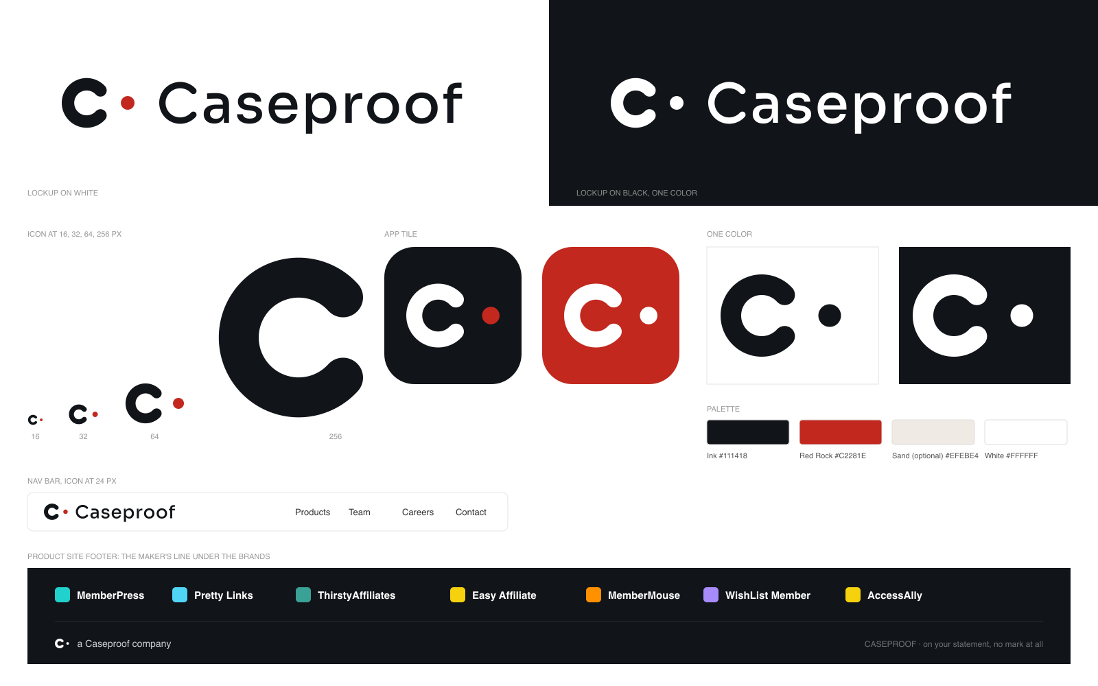
Why it lasts. At 16 pixels the pair is a C and a point and still reads as one mark; nothing in it is thinner than the stroke. At banner size the proportions are a quarter, three quarters, and one tenth, so it stays taut. In one color the disc keeps its meaning, because the meaning is a position. An employee can draw it in three seconds: a heavy C with a dot standing outside its mouth. It animates in one move: a closed ring opens, the piece that leaves rounds into a whole disc. Under MemberPress teal, Pretty Links cyan, and AccessAlly yellow, the ink C and its red point look like they were there first.
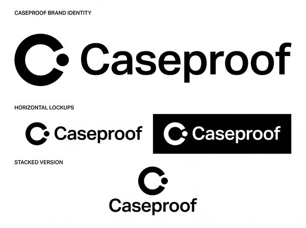
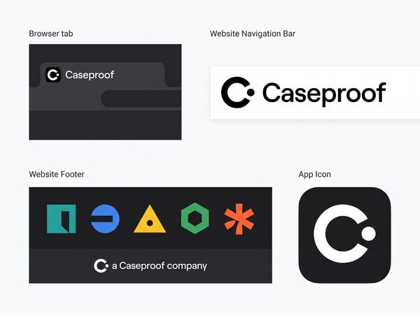
The wordmark. Sora at Medium, wide and calm, opened to +0.03 em so the word has air in it, outlined to paths. Three tweaks tie it to the mark. The capital C is redrawn as the icon's own C at the word's weight, same mouth, same round terminals, so the word begins with the signature and settles "Caseproof" as one word at one weight. That C's stroke is the mean of Sora's vertical and horizontal strokes, so it sits in the word without a bump. The gap between the dot and the word is four times the gap inside the mark, so the point belongs to the icon and never reads as a separator.
The lockup
At true size
The app icon
In motion
Proposal Five
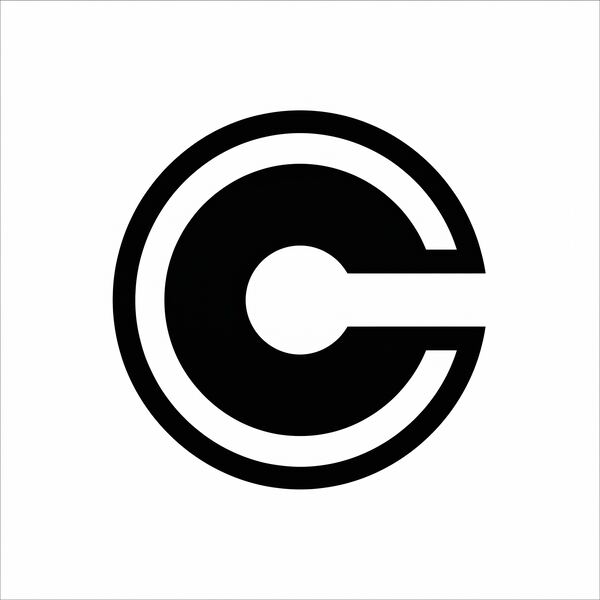
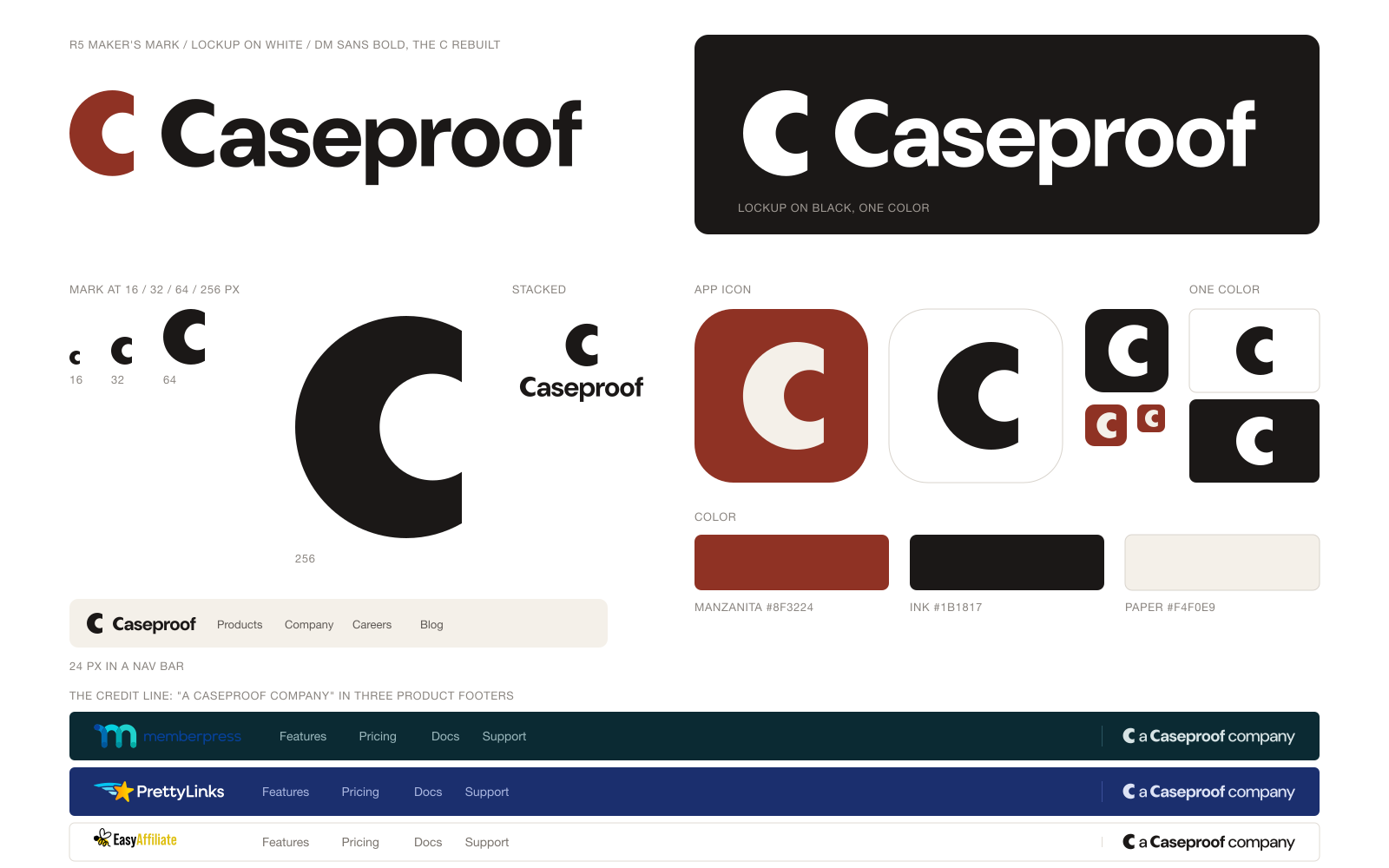
“Largely an employment company.” The thing Caseproof makes is a team, and its work ships under other names. The mark is a colophon: the small device a maker puts on work that carries someone else’s name.
The argument
The problem. Caseproof's name almost never stands alone. It sits in the footer of nine product sites, on a card statement, on a paycheck. Blair calls the company "largely an employment company": what it makes is a team, and the team's work ships under other names. The mark had to say who made the work at the size of a credit line, without competing with the brand on the page, and without the padlock from the lawyers' product of 2004.
The insight. A company that signs other people's products needs a colophon, the small device a printer sets on the last page. Such devices were made with a compass and a straightedge and are dense enough to survive at the bottom of a page. Caseproof has the same economy: cash, no debt, self-hosted, "do less, but better," holdcos named for the plants outside the founder's window. Strategy §1.1 (an employer whose products are owned by separate LLCs), §1.3 ("solve your own problem").
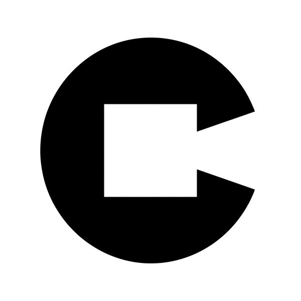
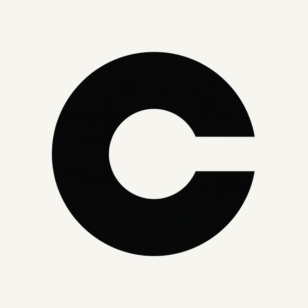
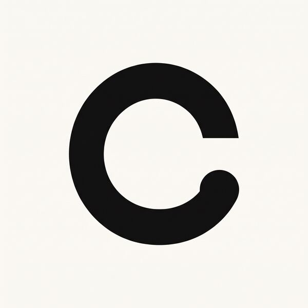
The form. Two circles and one cut. The outer circle is the body of the C. The counter is a second circle shifted toward the mouth, so the back of the letter is thick and the arms thin toward the opening: spine 38, arm 24.5, on a height of 100. One vertical line at 75 cuts the mouth; both terminals end flat on it. The letter has the heavy back of a book's spine, where a publisher puts its mark, and an open mouth, the case that holds and lets go.
Why it lasts. At 16 pixels the spine is six pixels wide and the mouth six tall, so it still reads as a C. At billboard size the construction shows. It is one closed path, complete in one color. Anyone can say it over the phone: a circle, a smaller circle inside it shifted right, one cut straight down, and the motion piece draws it in that order. Beside MemberPress teal, Pretty Links navy, or Easy Affiliate yellow it takes the footer's text color, a hair taller and heavier than the type.
The wordmark. DM Sans Bold, a grotesk with soft corners, outlined to paths and tracked minus 0.015 em. The capital C is rebuilt from the same construction at text weight: arm equal to the font's round stroke, spine 1.5 times that, mouth 48 percent of the height, terminals on one vertical line. In the credit line, "a" and "company" are set at Medium, so the name carries the weight and the mark a touch more.
The lockup
At true size
The app icon
In motion
For comparison
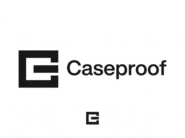
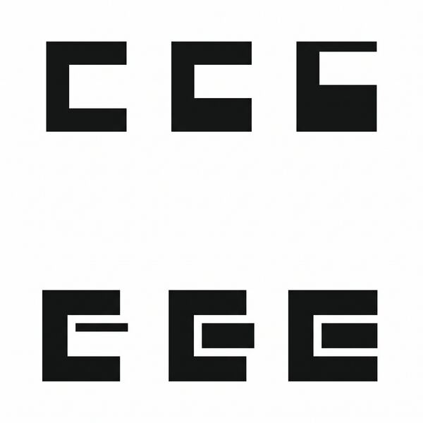
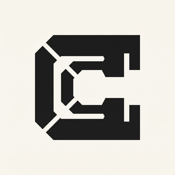
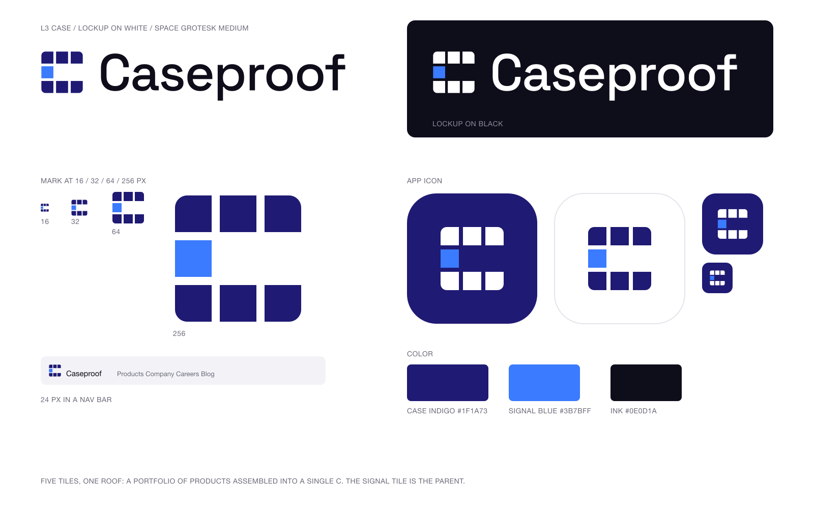
The form Blair liked, and may still use: a capital C built from five identical tiles, the open side left empty, one tile in blue.
A respectful note
L3 is strong on every craft test: it is still a C at 16 pixels, it works in one color, and it has no lock, no gradient, and no WordPress cue. Its form is not in question.
The argument under it is. L3’s stated reason is that each tile is a product, with the parent as the blue tile among them. That is the suite-of-products reading Blair has said he does not want, and the open side as “the portfolio is still growing” is a growth cliche. The five proposals above keep what L3 proves, a plain geometric C that holds up small, and ask each to earn its form from something only Caseproof could say.
Side by side
64 px, light
64 px, dark
16 px, light
16 px, dark